Having been fairly vocal about my opinion that a professional writer should have a website (much like any business), I decided to illustrate by example and point out several writers who have already taken the leap and acquired a working website.
What are Writer Websites?
Writer websites are a catch-all term for websites and blogs belonging to professional writers. These can include author websites, copywriter websites, and everything in between. Whether you know how to sell with words or you’re great at showing others how to write action scenes, a writer website will help you reach a wider audience.
How to Build a Writer Website
While some of these sites are quite visually appealing, the main takeaway I hope you’ll have is that websites don’t necessarily need to be complicated or expensive in order to be effective. If you’re willing to commit some time to learning the tools and some basic design, you can easily build one yourself. If your writing business/career is further along, you may opt to hire someone to build a website for you. While this is a great option, I still recommend learning the basics of the content management system used to build your site so you understand what’s going on and can at least update content.
My personal recommendation for building websites is WordPress; it’s user friendly, flexible, and the massive worldwide community makes it easy to find lessons and support related to most popular plugins and themes. Because of this I recommend going with a popular theme such as Divi (the theme this site is built on). In addition to having bigger communities attached to them, popular themes also tend to present fewer difficulties and have better support for when problems do arise.
My recommendations aside, what really matters is that your website is responsive (loads well on all devices), well laid out, and functional. There are still a surprising number of “professional” websites on the internet that include broken links, images that don’t load properly, insecure optin pages, and many other issues.
What follows are five examples of writer websites that I feel get at least most of these things right. They even go the extra mile by providing clear, concise information about the creators.
5 Writer Websites That Make Their Mark
SocalSarahWrites – Sarah Chen

Sarah’s website is an excellent example to get started with. Immediately the header image and menu inform us about what Sarah does and how to contact her. We also get a peek at an elegant word cloud that delves even further into the specific niches she writes in.
The main strengths I see in Sarah’s website are its clean layout, clear intention, and easy accessibility. One criticism I might make is that there are a lot of potential paths for a visitor to take. Upon loading the first page, we have social media icons, menus, sliders, and a search bar to choose from. Combined with the word cloud, some less tech-savvy folk might describe the site as “busy”. I also noticed that the site loads a little slowly on mobile, mostly because of its many unoptimized images.
Personally I think it looks beautiful, but it is slightly slider-happy. I don’t personally have much of an opinion on sliders, but I’ve heard other more experienced web designers talk about them like an outdated design element. I do think there’s a time and a place for them, but realistically they should serve a purpose other than showing off an alternate image.
I was able to get to Sarah’s contact form with one click on desktop and two taps on mobile, which is excellent. Many people will spend less than thirty seconds on a website unless they find exactly what they’re looking for in that time. If someone’s looking to contact you, it’s important that they find the right page quickly!
More than anything else I admire the theme and color scheme of Sarah’s website. Despite containing a blend of colors, the two images visible above the fold (when the page first loads) go remarkably well together, and give me an immediate “Socal” vibe.
Michael Van Kerckhove
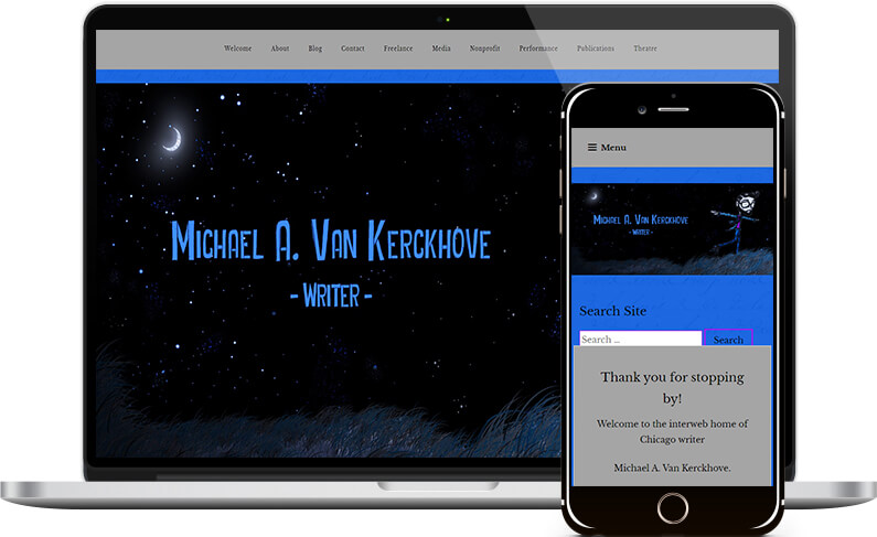
Michael’s site has some really beautiful art and, similar to Sarah’s, is descriptive and easy to navigate. One of this website’s main strengths is the simplicity of the layout it displays upon initially loading. On desktop we get a beautiful and descriptive image and a clear and informative menu. On mobile, the menu appears in typical hamburger form, and the site search function is prominent. No matter what type of device you visit Michael’s site on, you’ll be able to find what you’re after quickly.
The only recommendation I can immediately think of that would improve this writer website design-wise is removing the link in the header image. If someone navigates to the main page and then clicks on the header, they’ll end up waiting for the same page to load again!
That brings me to the site’s main weakness; it takes a long time to load, especially on mobile devices. I ran a quick scan and it looks like the main issue is render-blocking code (most likely created by using the Elementor page builder) as well as some server-level settings that need to be optimized, such as text compression.
With the pages and blog easily accessible from the top menu and a simple but eyeball-friendly color scheme, this website is an excellent example of how effective an online portfolio can be.
Debra McElroy
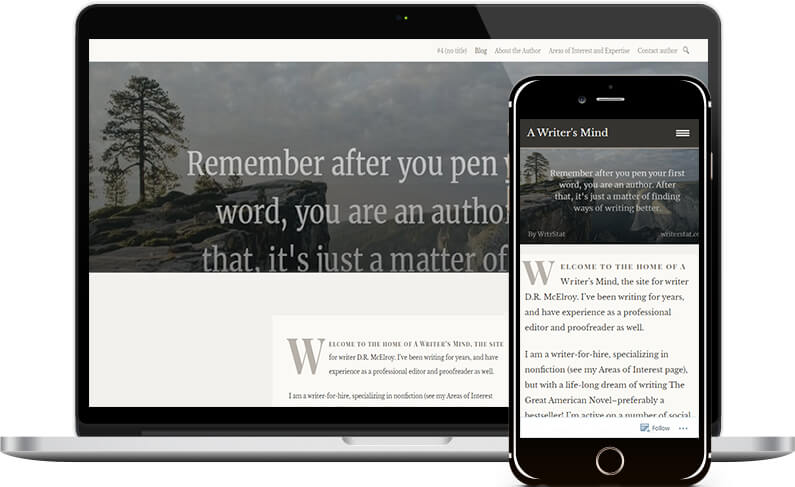
Unlike the first two examples, Debra’s website uses a simple layout and loads lightning fast because of it. I do think that the initial paint of the website looks a bit wordy (especially on mobile), but it is a writer website so maybe she can get away with that.
One things that Debra’s site has in common with the first two is its easy navigability. I was able to get to her contact form in one click on desktop and two taps on mobile. Unfortunately, I couldn’t quite figure out how her contact form worked. Her email was listed, so I could contact her that way if I wanted, but it seems as though there might be a design flaw somewhere in the form. Some of the menu items also have slightly confusing titles.
Overall I think this site could use a quick touch-up in a few areas, but the important things is that it loads quickly and it gives plenty of easy to access information about the writer. I really like Debra’s design, it has a very genuine look and feel that tells me she is a writer immediately.
Jacqueline Vanderpuye

Jacqueline’s site is an elegantly laid out one-page website with some clear strengths and also some opportunities for improvement. I like the color scheme and think the layout is extremely clean and easy to navigate despite the many elements on the page. However there are places (including on the first paint, visible above) where the text is a little bit difficult to read because of the background.
One weakness which is typical of one page websites is that Jacqueline’s site takes awhile to load on mobile. However considering the length of the page the time isn’t actually that bad.
I think Jacqueline’ greatest strength is the way she shows off her writing skill and personality in the copy on the page. She also does a great job of presenting relevant information in a logical sequence, drawing the visitor towards the end goal of contacting/hiring her.
Born Again Minimalist – Caitlin Fisher

Caitlin’s website is simple but effective, a classic blog-style website that greets the user with her picture and gets right down to explaining what Caitlin is all about. The site loads very quickly, even on mobile, and does so in a reasonably fluid and clean manner.
I think that simplicity is a great approach for writer websites, but there are a few adjustments that could be made to help this site maintain the average visitor’s attention. I think a slightly larger font size might be beneficial, but I really like how the color scheme gives a romantic vibe that ties in with some of her content.
Which of these websites inspires you the most? Are you a writer thinking about getting your own site? Let me know where you’re at in the process with a comment!

All Of These Websites Are Built On WordPress
Caitlin’s site is built on WordPress.com (which is different from WordPress.org), but it’s no coincidence that the other four sites are built on self-hosted WordPress and ALL of them use a version of the same CMS at the end of the day.
I didn’t make any effort to find WordPress websites; I just asked for volunteers with websites in my writing communities to step forward. WordPress powers a massive share of online real estate because it’s so easy to build and maintain a professional looking website.
That said, not everyone has the time or the desire to learn the skills necessary to design and create a website, even a simple blog. If you’d like to discuss your options or get some advice on how to start, feel free to contact me. Be sure to let me know in the message field that you’re interested in WordPress!
If you’re more of a DIYer but want some more advice, check out my hosting recommendations. A good web host is one of the first things required for a successful website.